Working on various websites and web apps for over a decade, I've gravitated around certain words and phrases to talk about design constraints in user interfaces. Despite the rich vocabulary for talking about visual design, it feels like there isn't a great way to accurately describe the interconnected nature of working with design constraints. Talking about color palettes, using typographic scales, themes to codify the design language, or the component API of a particular library has often felt a little too disjointed for what I think should be a tightly woven system.
The term design systems used to somewhat fill this void, however it's taken on a much larger meaning over the past few years and includes the people, organizations, and processes (among many other things), in addition to the implementation details. So, how can we talk about the implementation details of UI design in a more precise way? And, how can we build upon these concepts to push UI design to a higher level of abstraction?
While working on tools that prioritize interoperability, themeability, portability, and the concepts of libraries like Theme UI, I've started thinking about a more holistic view that I call the Design Graph.
What is the Design Graph?
The Design Graph is a constraint-based system for organizing styles in UI design.
The Design Graph isn't an actual implementation, but rather a conceptual model that includes pairwise relationships between its parts, or nodes to borrow a term from graph theory. Theme UI is one implementation that attempts to adhere to this model, and it's a great example of how the Design Graph can become more than the sum of its parts. Theme UI's source code isn't particularly complex or large, and it's similar to a few other libraries out there. The thing that really differentiates Theme UI is that it's meant to be built upon, hacked on, and iterated on to enable a higher level of interoperability across libraries. If you only look at what Theme UI does, you'll easily miss what it can enable.
If you use Theme UI to build Gatsby themes, a component library, or a website, these things should all just work with other tools like Blocks UI. In the future, imagine if there are VS Code and Figma plugins, documentation generators, static analysis tools, and more that follow the same Design Graph schema so that the component library you have today gets a whole lot better over time. I want this imaginary future.
What is this for?
Beyond a larger ecosystem effect, the Design Graph is meant to help answer some practical questions when implementing design systems, such as:
What should we call this?
Naming things is hard. The fewer things you need to name, the more time and energy you can spend solving more important problems for your product. With a standard interface and naming conventions for storing raw values in your UI, more and more tools and abstractions can be built on top of this lower-level framework. By naming things in a consistent way, we get interoperability for free.
Where should we put this?
Although people love to organize things, we're really terrible at doing so in a way that makes sense to others.
The Design Graph doesn't try to completely solve this, but it provides guidance for where certain aspects of your UI design should live.
For example, raw color values belong in the colors scale, and variations of your button styles belong in the buttons variants.
How do we use this?
Creating sensible but flexible component APIs is hard.
When building out a library of components, it's generally beneficial to reuse props APIs across multiple components whenever possible.
This helps maintain a minimum API surface area and allows for a learn once, use anywhere effect.
With Theme UI,
contextual component styles can be set with the variant prop, and can be augmented or overridden with the sx prop, which acts as a sort of escape hatch.
What does it look like?
I would consider this a work-in-progress, but from a high level, the Design Graph includes the following core nodes:
- Scales are limited collections of raw values that map to specific style properties.
For example, values for
font-sizeare stored in thefontSizesscale. - Components are elements that have styles constrained by scales.
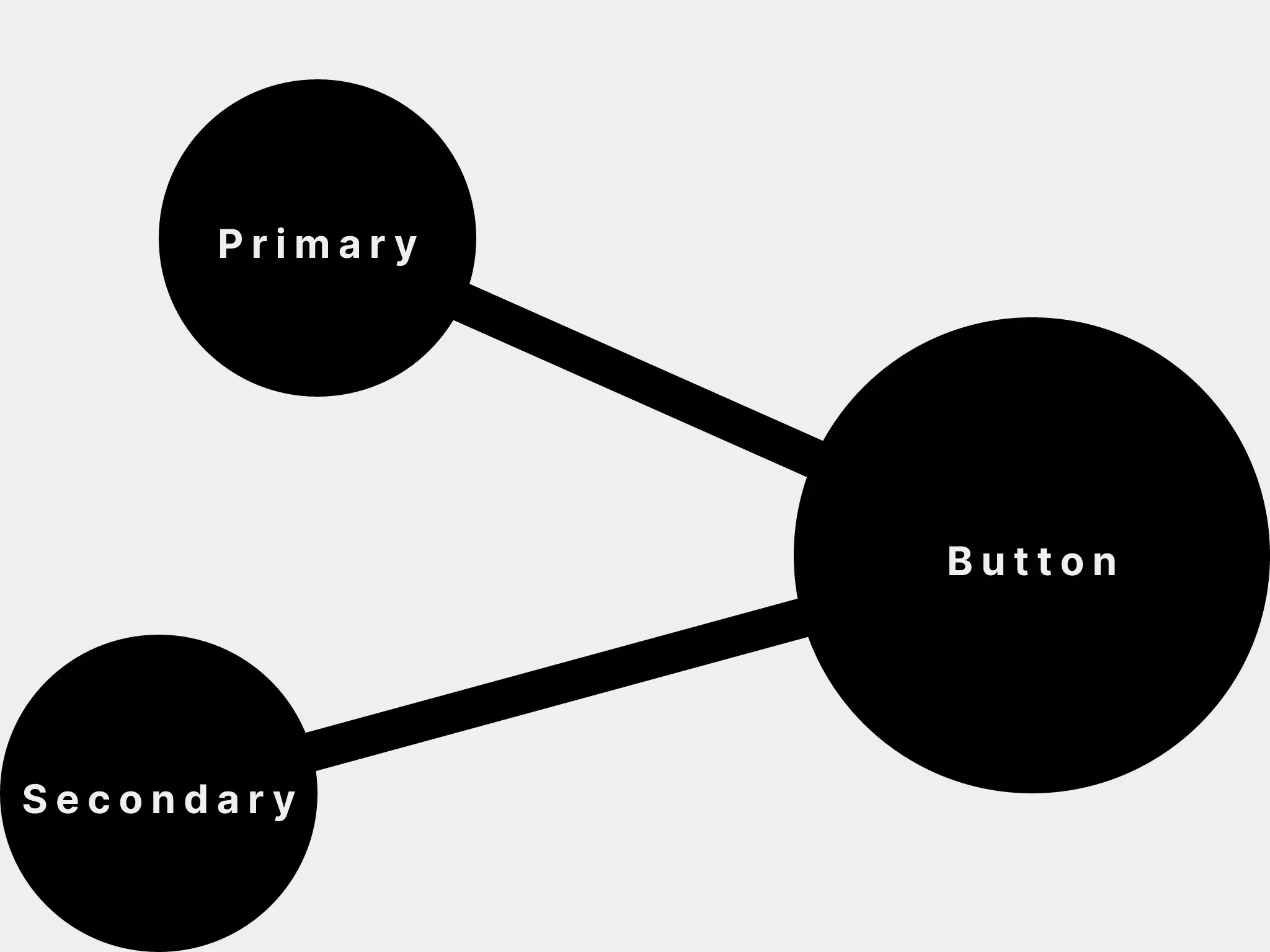
- Variants are partial styles that map to specific components. For example, a button might have primary and secondary variants, or large and small variants.
- Themes are collections of scales (and possibly variants) that encapsulate a particular visual design language. Ideally, themes follow a common interface (or schema) and can be swapped out in different implementations.
These nodes are inherently interconnected and help form the larger graph.
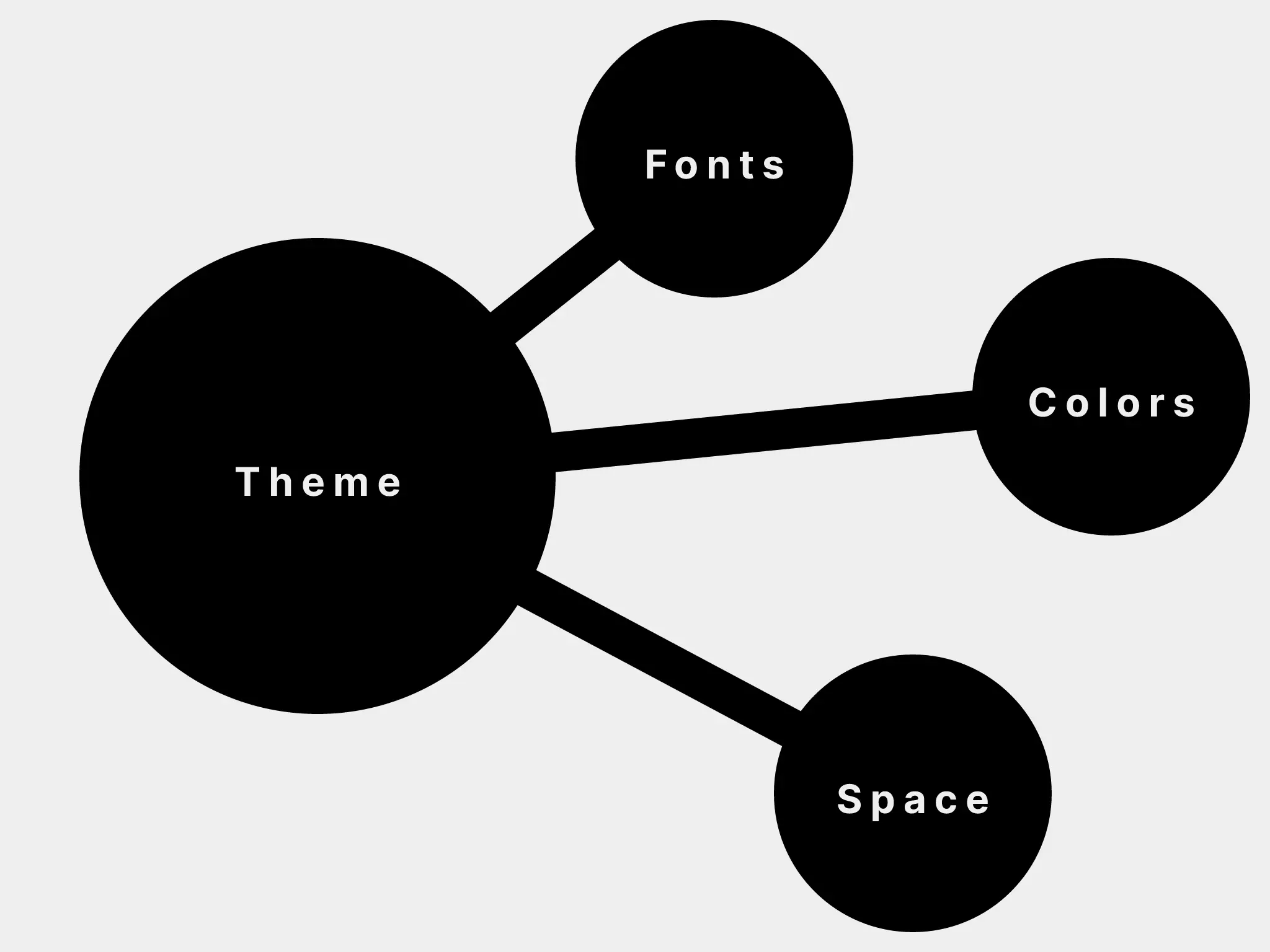
Themes to Scales
A theme object is composed of multiple scales. These scales could include fonts, font sizes, colors, and more.

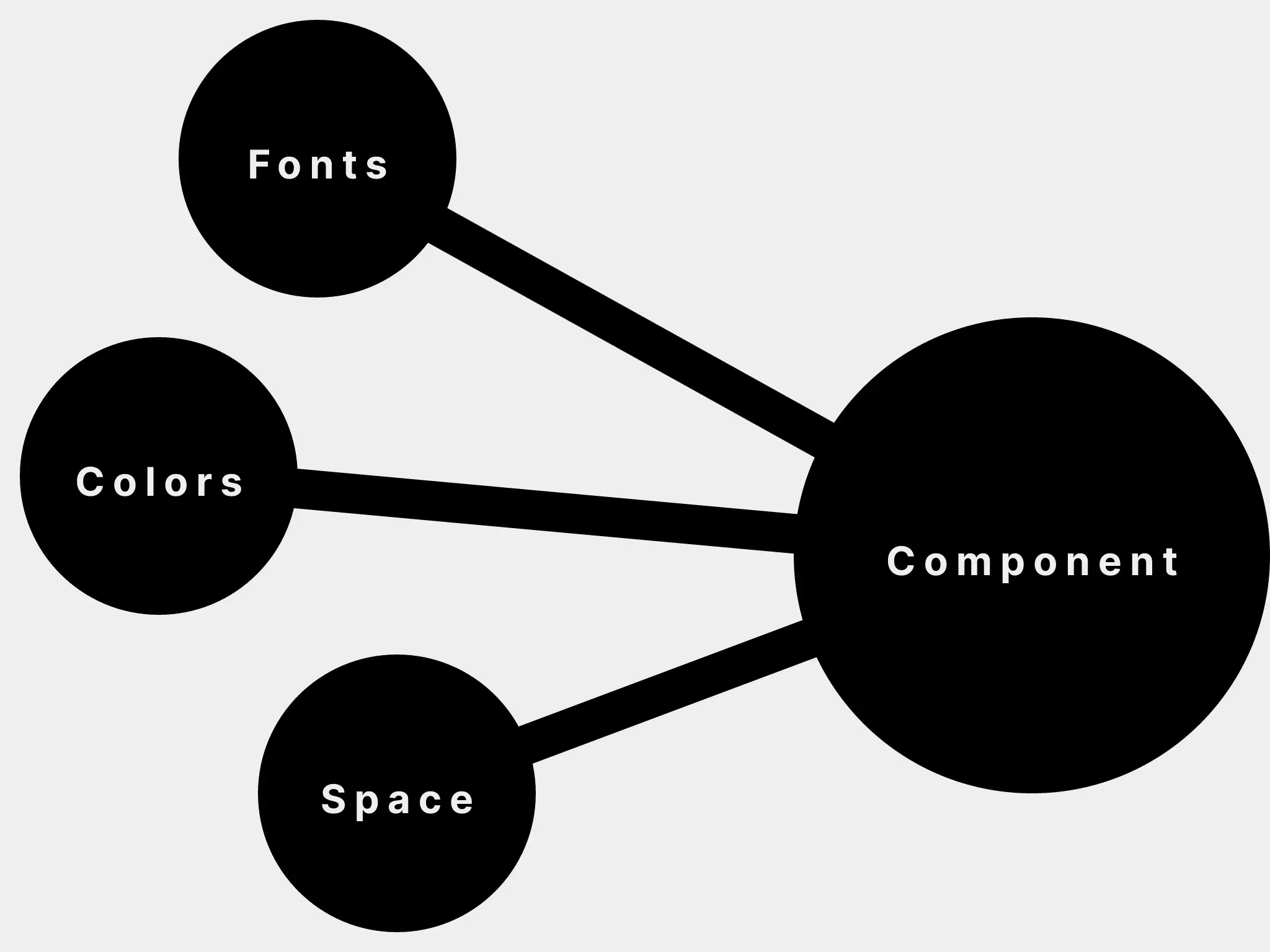
Scales to Components
A component's styles use scales.

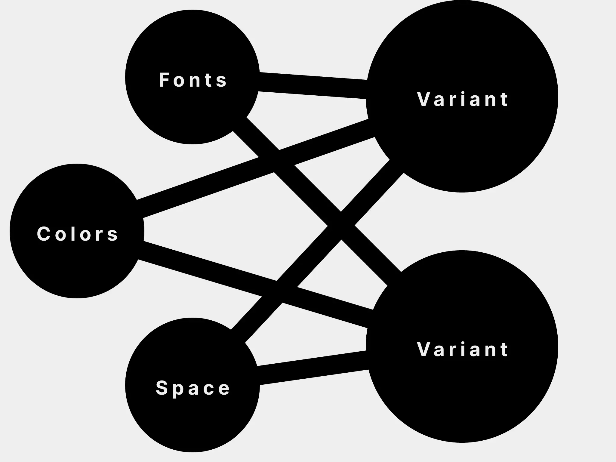
Scales to Variants
Variants also use scales. Variants are usually the parts of a component's styles that might change contextually or dynamically.

Component to Variants
A component can use multiple variants. Some variants can also be shared across multiple components. For example, you could share accessible color combinations with a badge component and an alert or message component.

Putting it all together
As an example to demonstrate how some of these pieces fit together, a theme with typographic scales can be used to create a component that accepts multiple variants.
// example theme with typographic scales
{
  fonts: {
    body: 'Helvetica',
    heading: 'Garamond',
  },
  fontWeights: {
    body: 400,
    heading: 700,
    bold: 700,
  },
  lineHeights: {
    body: 1.625,
    heading: 1.25,
  },
  fontSizes: [ 12, 14, 16, 20, 24, 32, 48 ],
}
These scales can be used to create variants.
// example variants
text: {
  heading: {
    fontFamily: 'heading',
    fontWeight: 'heading',
    lineHeight: 'heading',
    fontSize: 5,
  },
  title: {
    fontFamily: 'heading',
    fontWeight: 'heading',
    lineHeight: 'heading',
    fontSize: 6,
  },
  lead: {
    fontFamily: 'body',
    fontWeight: 'body',
    lineHeight: 'body',
    fontSize: 3,
  },
  small: {
    fontFamily: 'body',
    fontWeight: 'body',
    lineHeight: 'body',
    fontSize: 0,
  },
}
Then these variants can be used in a component.
<Text as='h1' variant='heading'>
  Hello
</Text>
<Text variant='lead'>
  This component has variants.
</Text>
More than the sum of its parts
Beyond a single application or site, the Design Graph is the sort of thing that can exist at a larger level across an entire organization or across multiple organizations. In a way, the more libraries and applications that adopt this concept, the larger the graph gets, and the more tooling we can share. Imagine installing a component from npm, and it's already compatible with your design system. Or imagine reusing a core set of components with variants across multiple clients with drastically different visual designs. Imagine all these components can be visually tweaked from your design tool using a plugin and the changes are reflected back in your text editor. If you're interested in helping build and shape this vision, join us on GitHub or let me know what you think on Twitter.
Thanks to John Otander for related explorations in DesignQL, Jina Anne for all the work on design tokens, and Diana Mounter for infinite inspiration.
